前言:
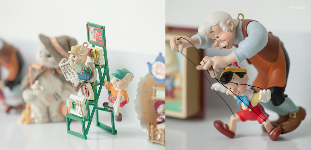
屋主通过老客户介绍找到我们,男主人从事设计行业,女主人喜欢收藏有色彩的玩偶,常住人口目前是一家三口,预留二胎房间。家可“仰观宇宙之大”亦可“俯察品类之盛”。原户型为一套复式,前后两个花园、视野宽阔、采光透风条件好。屋主希望结合现有房屋特点打造自然温馨的居家之所,因此我们在材质和色调上都尽量里应外合。
The owner found us through the introduction of an old customer. The male owner is engaged in the design industry, and the female owner likes to collect colorful dolls. The permanent population is currently a family of three, and a room for the second child is reserved. Homes can "look up at the greatness of the universe" or "look down at the prosperity of categories". The original apartment type is a duplex, with two gardens in the front and back, wide field of vision, good lighting and ventilation conditions. The owner wants to combine the characteristics of the existing house to create a natural and warm home, so we try to integrate the inside and outside as much as possible in terms of materials and colors.
◾1楼原客厅尺度偏小。
◾1楼卧室厨房主过道狭窄拥堵。
◾1楼厨房操作台面少,与卫生间门对门,动线不合理,空间封闭。
◾2楼楼梯间主过道狭窄。
◾2楼主卧衣帽间储物较少。
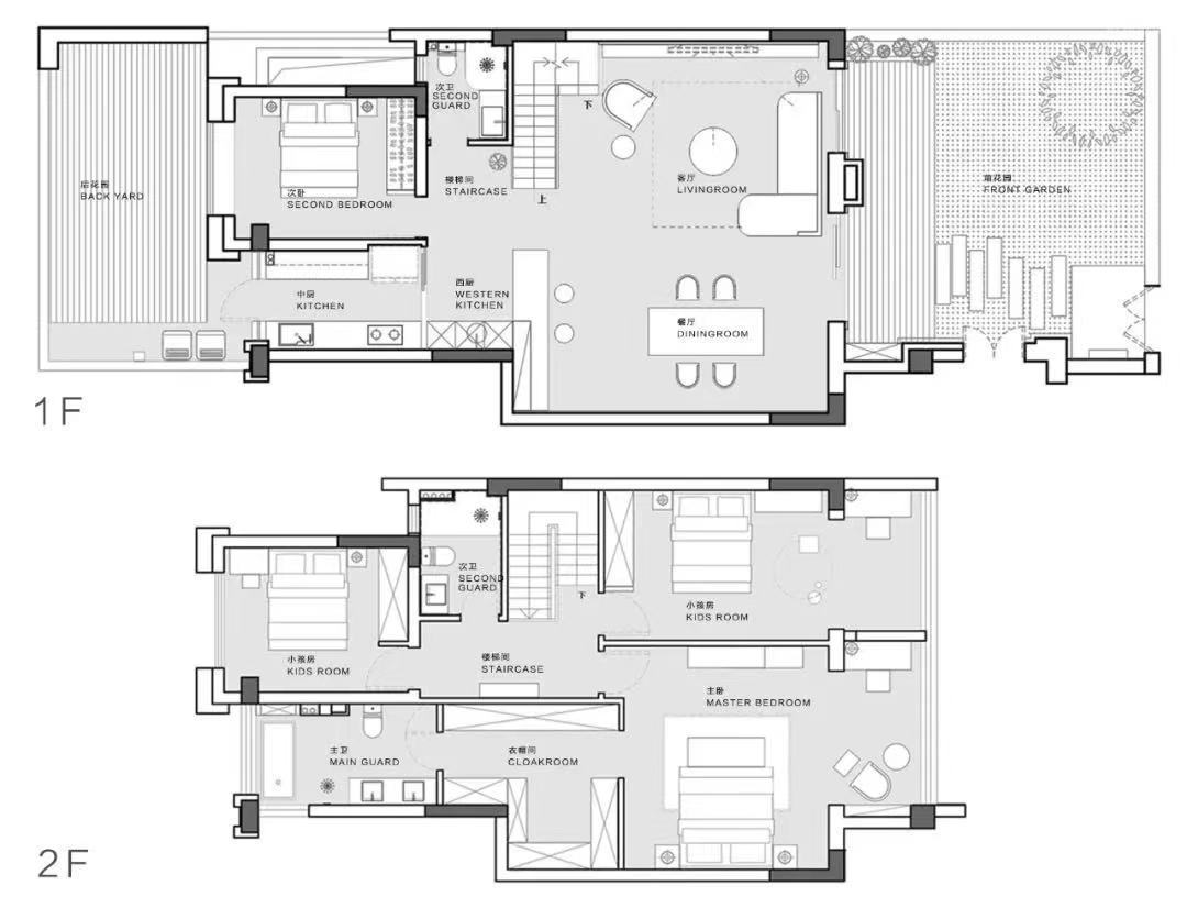
◾在根据客户希望尽量保持原结构的要求下我们做了以下改动。
◾搭建楼梯间位置楼板,加大客厅面积。
◾打破客厅传统布局,增加家人互动,动向流畅,实现空间视野最大化。
◾增设西厨,满足屋主多样化功能要求,让空间更加多元而有层次感。
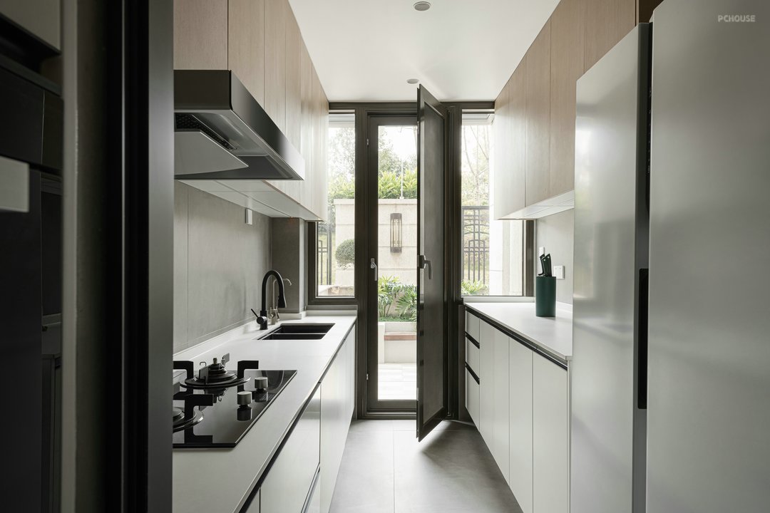
◾改变厨房进门方向,把厨房原有的门砌薄墙,可以让冰箱少占用过道空间。
◾在餐厅的方向开双推门,操作空间扩大的同时引进后花园光线。
◾1楼2楼卫生间缩小,释放过道空间。
◾2楼打造主卧套房,增加衣柜收纳,提供更舒适的休息空间。
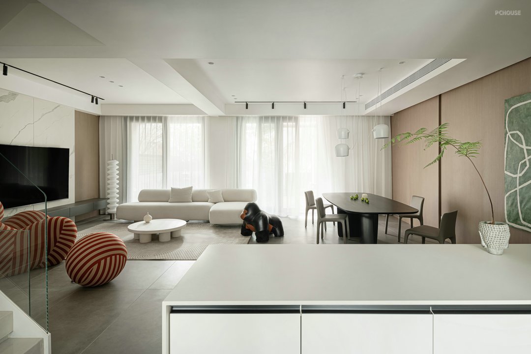
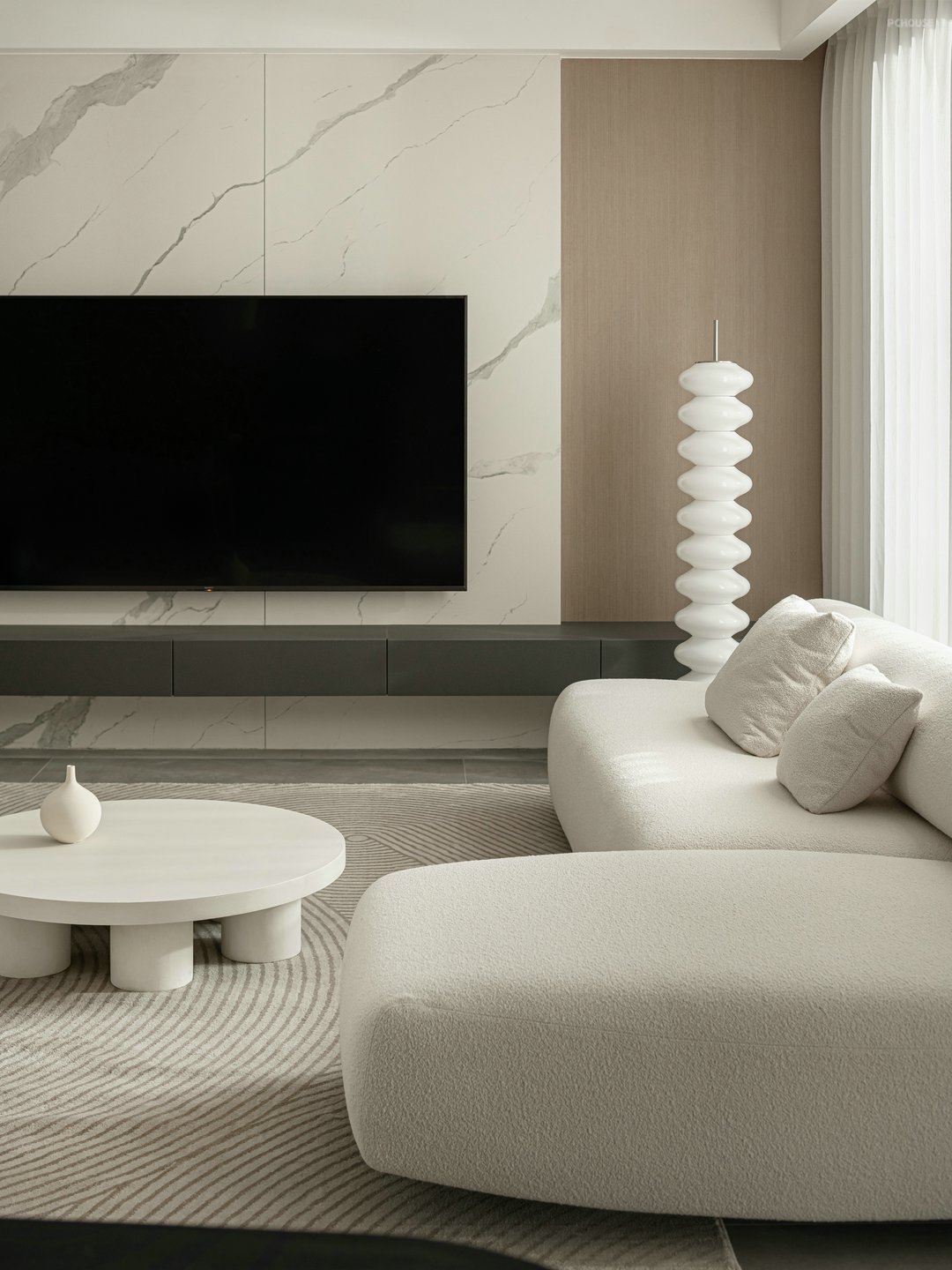
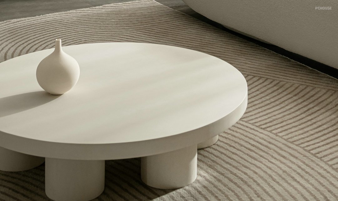
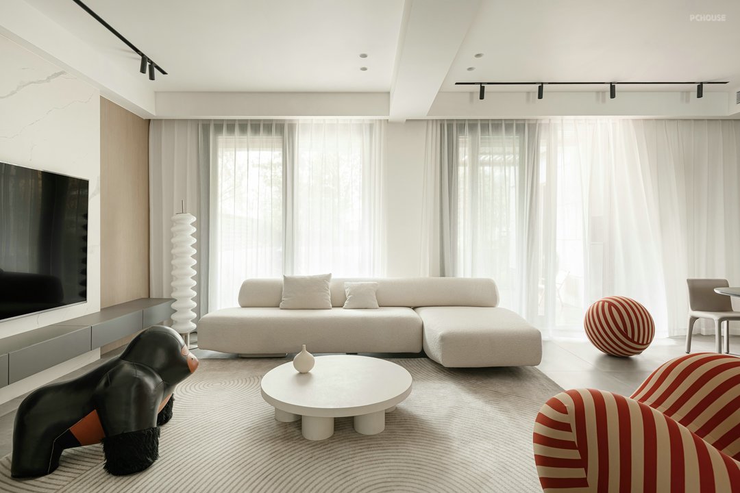
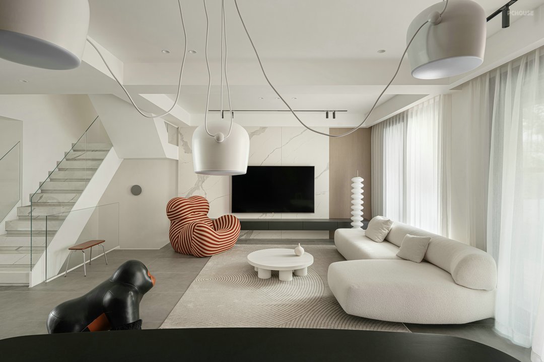
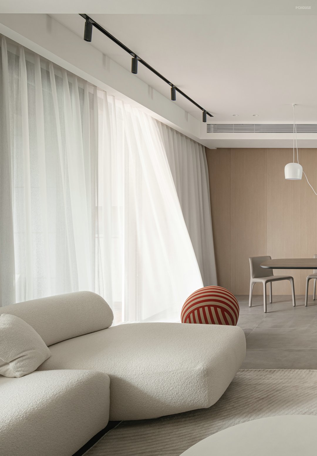
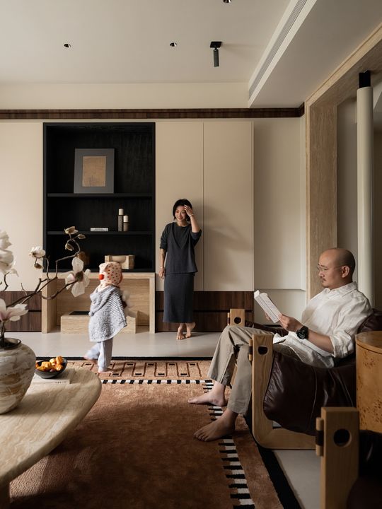
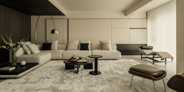
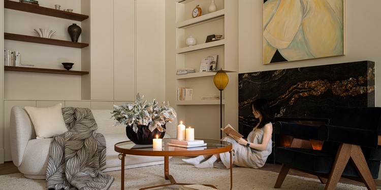
柔白、原木色为整个空间的主色调,搭配有色彩的软装饰品,让空间静谧而不单调。沙发对坐设计营造家人交流分享的亲近空间,同时让餐厅区域动线更流畅。
Soft white and log color are the main colors of the whole space, with soft decorations with colors to make the space quiet and not monotonous. The sofa sits opposite to each other to create a close space for family to communicate and share, and at the same time make the movement of the restaurant area smoother.
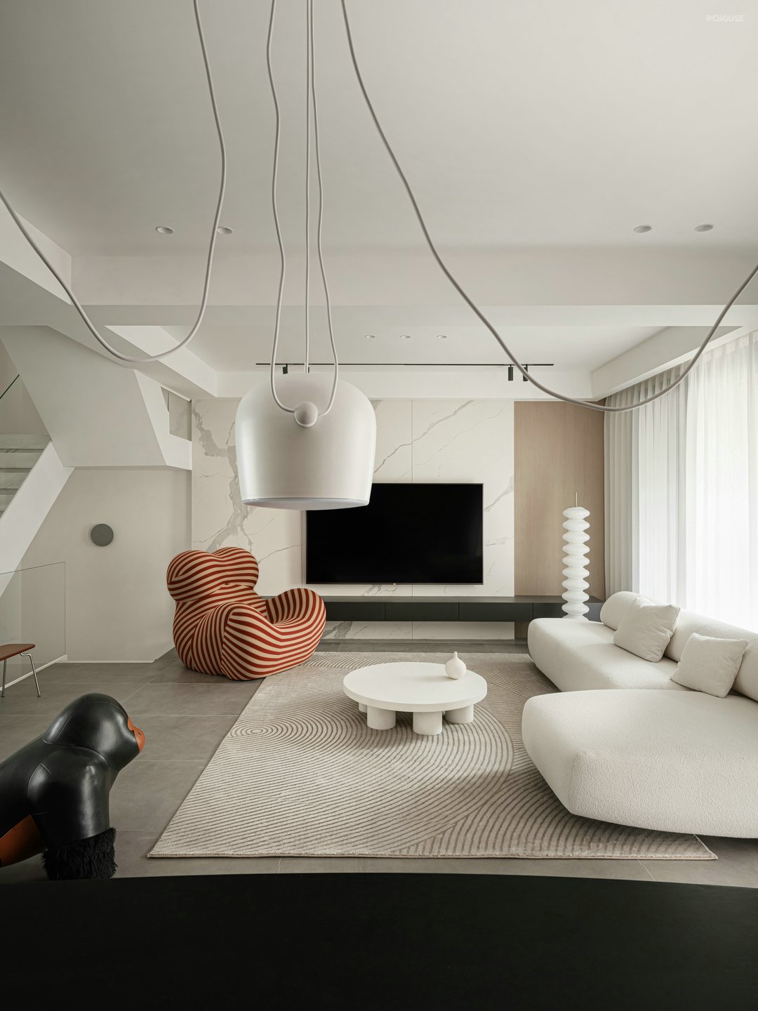
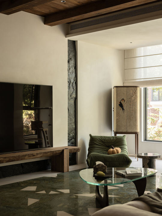
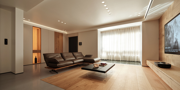
电视背景墙材质采用岩板与木饰,质感又柔和。创造了不一样的空间立面形态。多动线设计让客厅与餐厅连贯且独立,增加空间互动又让空间更加宽敞。妈妈的怀抱和猩猩凳满足功能需求的同时增加生活情调。
The TV background wall is made of slate and wood, with a soft texture. Created a different spatial façade form. The multi-moving line design makes the living room and dining room coherent and independent, increasing the space interaction and making the space more spacious. The mother's arms and the orangutan stool meet the functional needs and increase the mood of life.
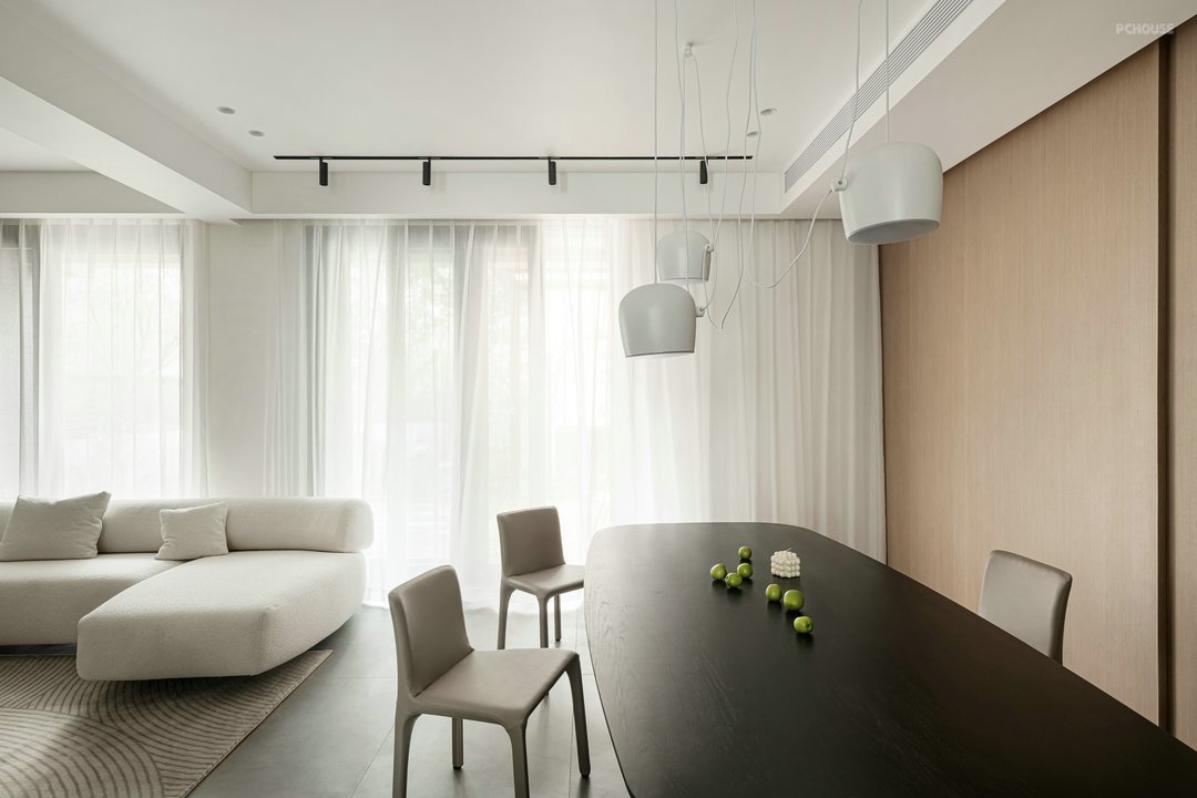
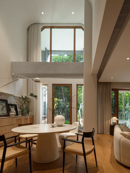
餐厅和客厅连在一起,顶面、地面同样做了一体化处理让整个空间看起来更整体、宽敞。餐厅吃饭也可以追剧。
The dining room and the living room are connected together, and the top surface and the ground are also integrated to make the whole space look more integrated and spacious. You can also follow the drama while eating in the restaurant.
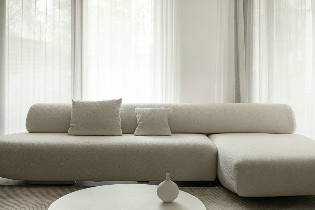
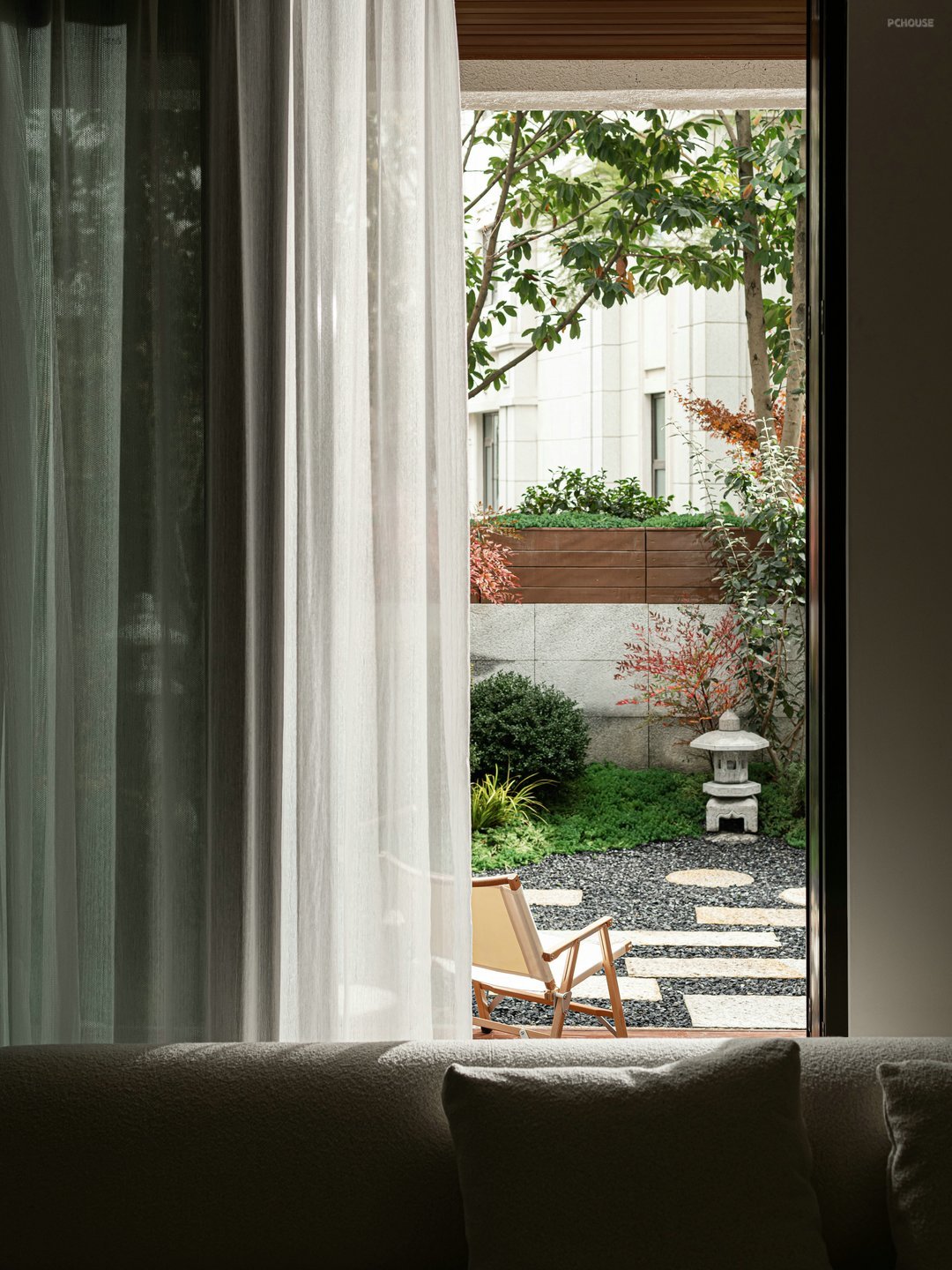
光线通过整面窗纱洒进室内让本来具有柔美曲线的沙发让人感觉更加想亲近。推开门花园景色映入眼帘,在家也能与自然更亲近。饮一壶茶、听一首音乐让时光慢下来,风是常来串门的邻居......
The light sprinkled into the room through the whole window screen makes the sofa with soft curves make people feel more close. Open the door and the garden view comes into view, and you can get closer to nature at home. Drink a pot of tea, listen to a piece of music to slow down the time, the wind is a neighbor who often visits...
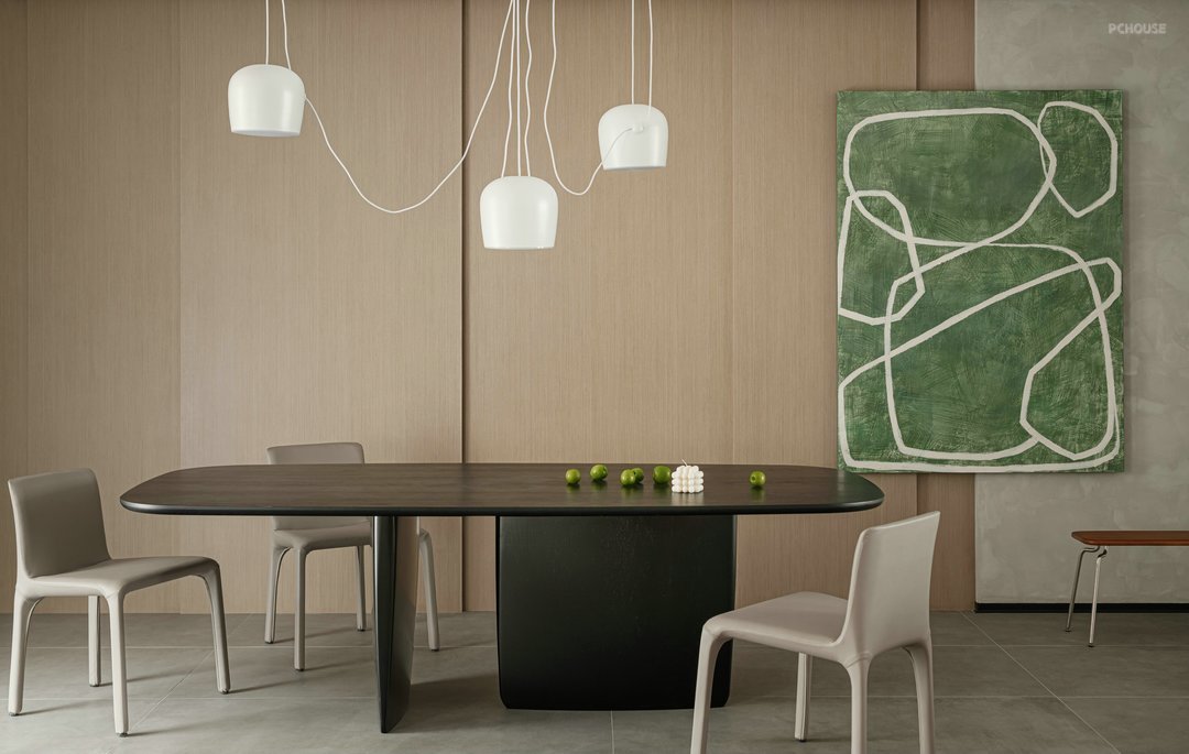
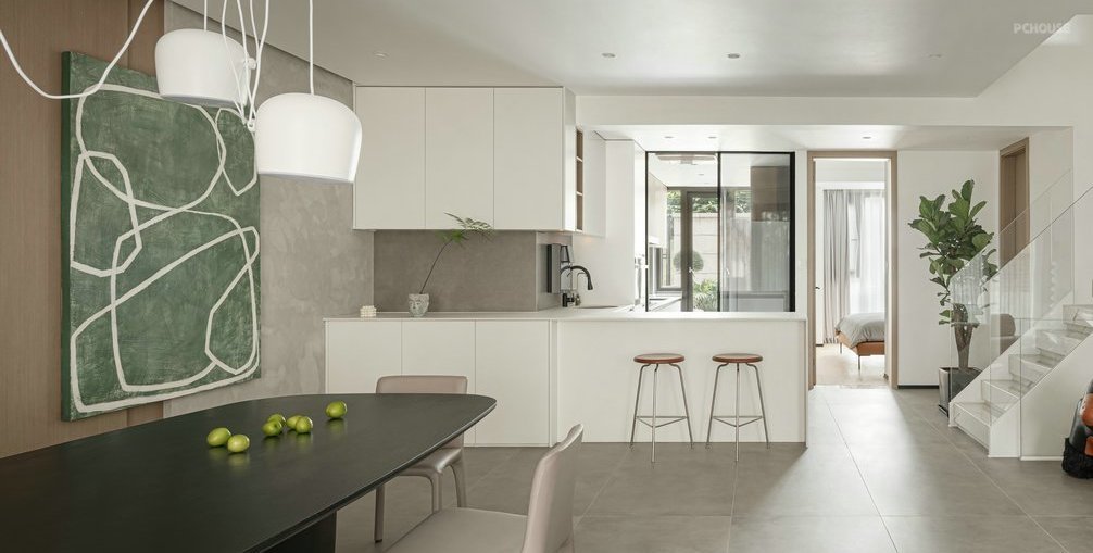
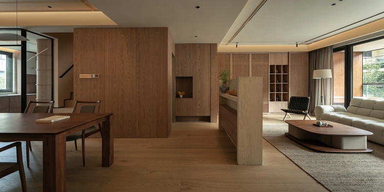
餐厅背景墙是木饰面和艺术漆结合,营造自然放松的氛围。绿色装饰画很好的融入整个餐厅似乎本来就是其中的一份子。
The integrated design of the island table and dining table in the kitchen creates a fusion dining and kitchen space. LDK's integrated life situation makes the home atmosphere more intense and warm.
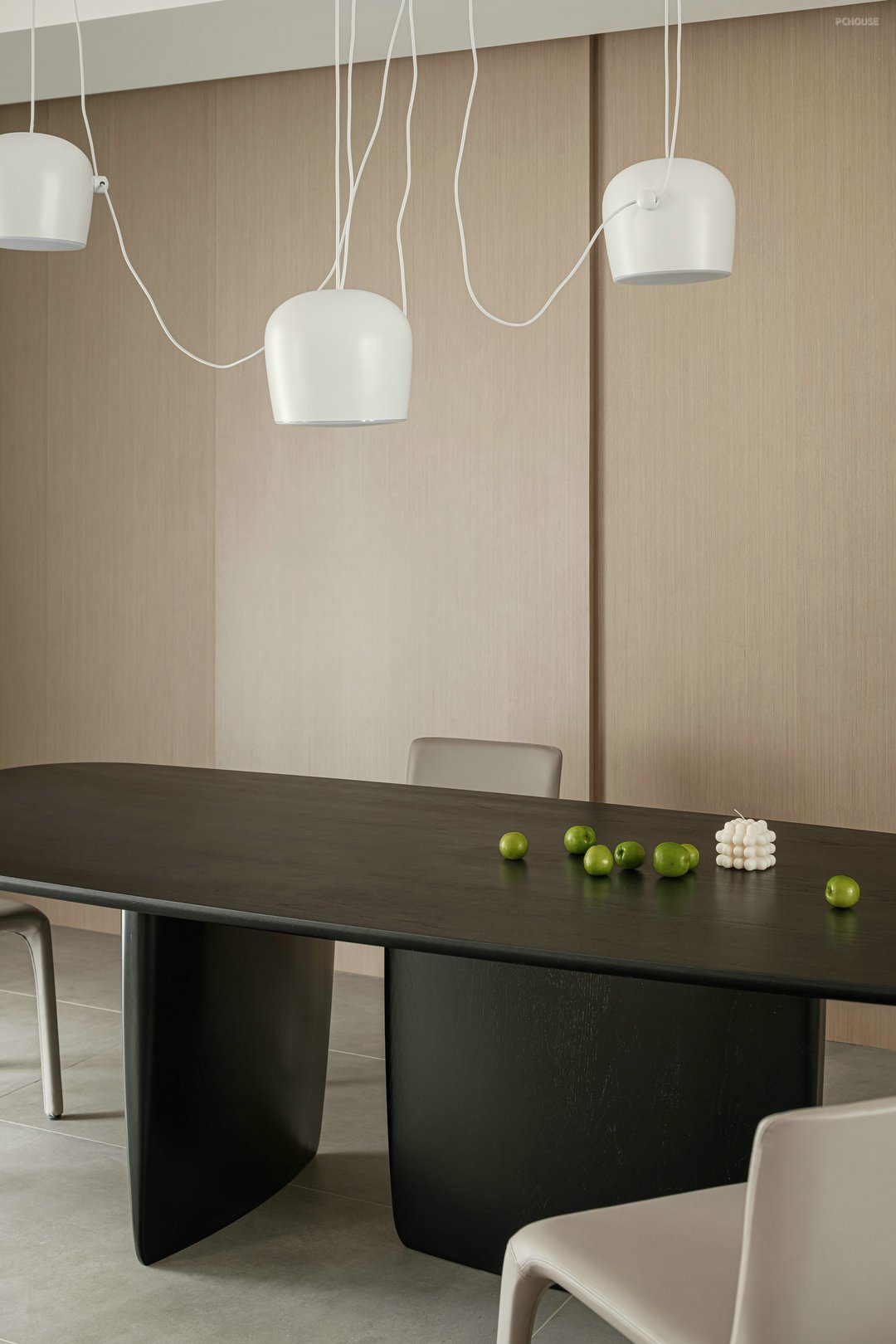
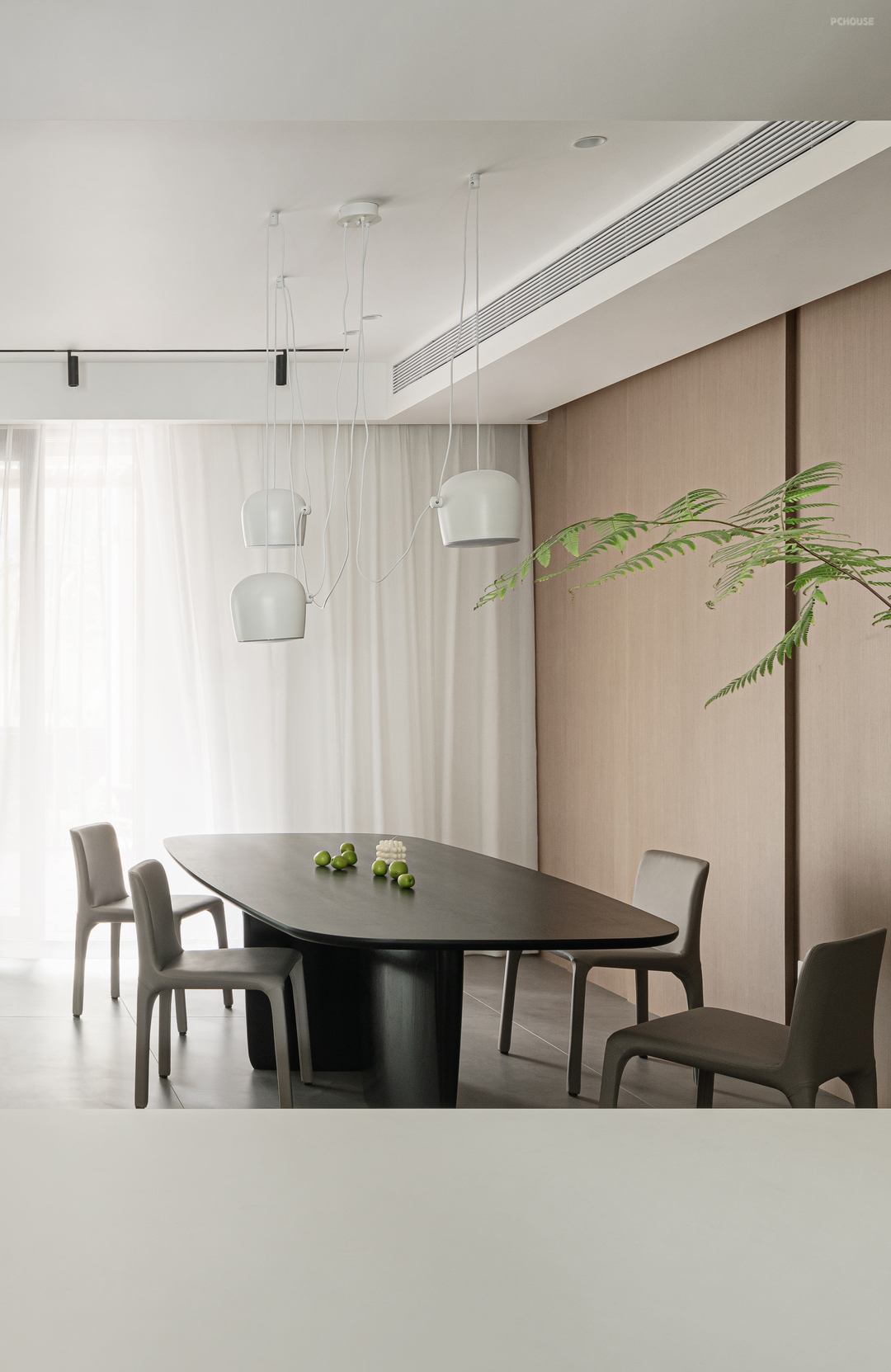
改造后的厨房门把后花园的光引进来让餐厅更加通透明亮,在2.4m黑色大餐桌上与家人共享美食,黑色实木餐桌与背景搭配出平衡美感。也让餐厅与客厅、西厨实现了联动的可能。空间场景得到了丰富,让家有更多可能......
The renovated kitchen door brings in the light from the back garden to make the restaurant more transparent and bright. Share food with your family on the 2.4m large black dining table. The black solid wood dining table and the background are matched to create a balanced beauty. It also makes the possibility of linkage between the dining room, living room and western kitchen. The space scene has been enriched, making the home more possible...
扩展后的厨房干湿分离更明确,让做饭不再是一件枯燥的事。厨房延用客餐厅色调,改变动向后的厨房通透实用。
The expanded kitchen has a clearer separation of wet and dry, making cooking no longer a boring task. The kitchen continues the color of the guest dining room, and the kitchen after the change is transparent and practical.
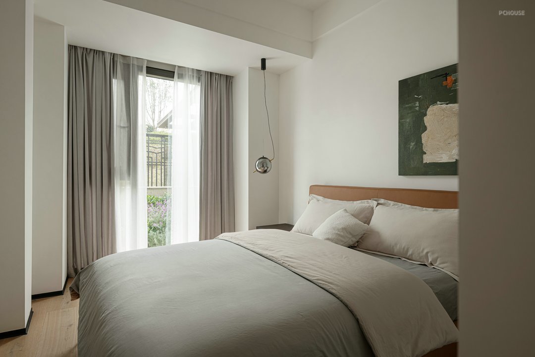
客卧窗外花园景色入室,室内挂画与窗外色调呼应。
The view of the garden outside the window of the guest bedroom comes into the room, and the paintings inside echo the colors outside the window.
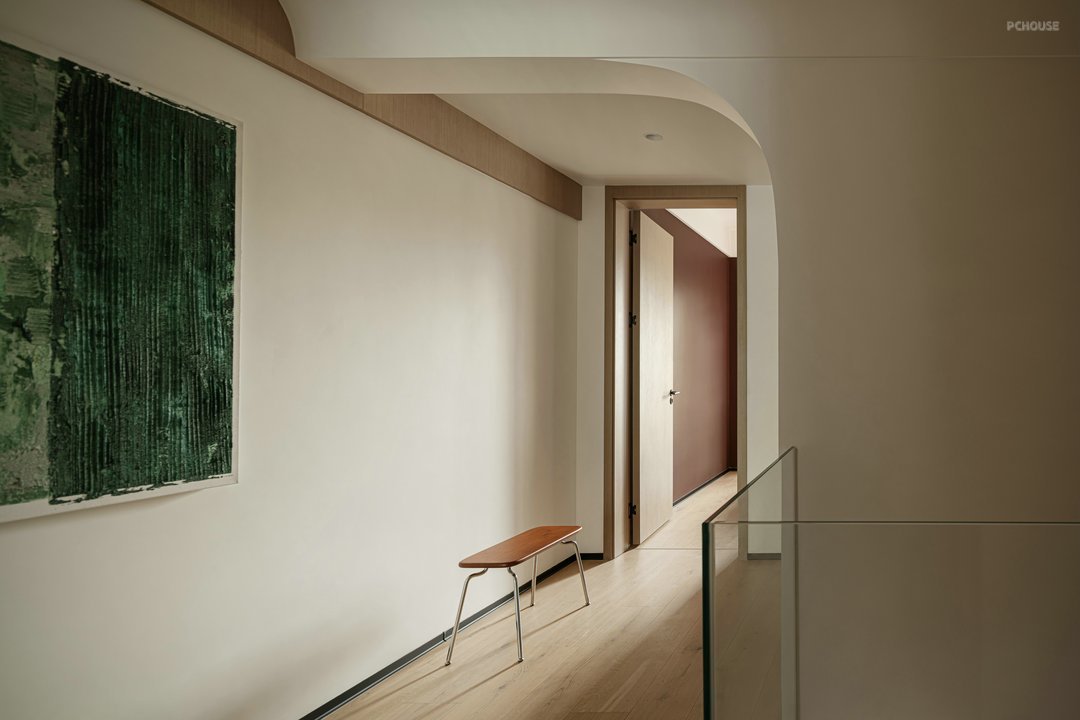
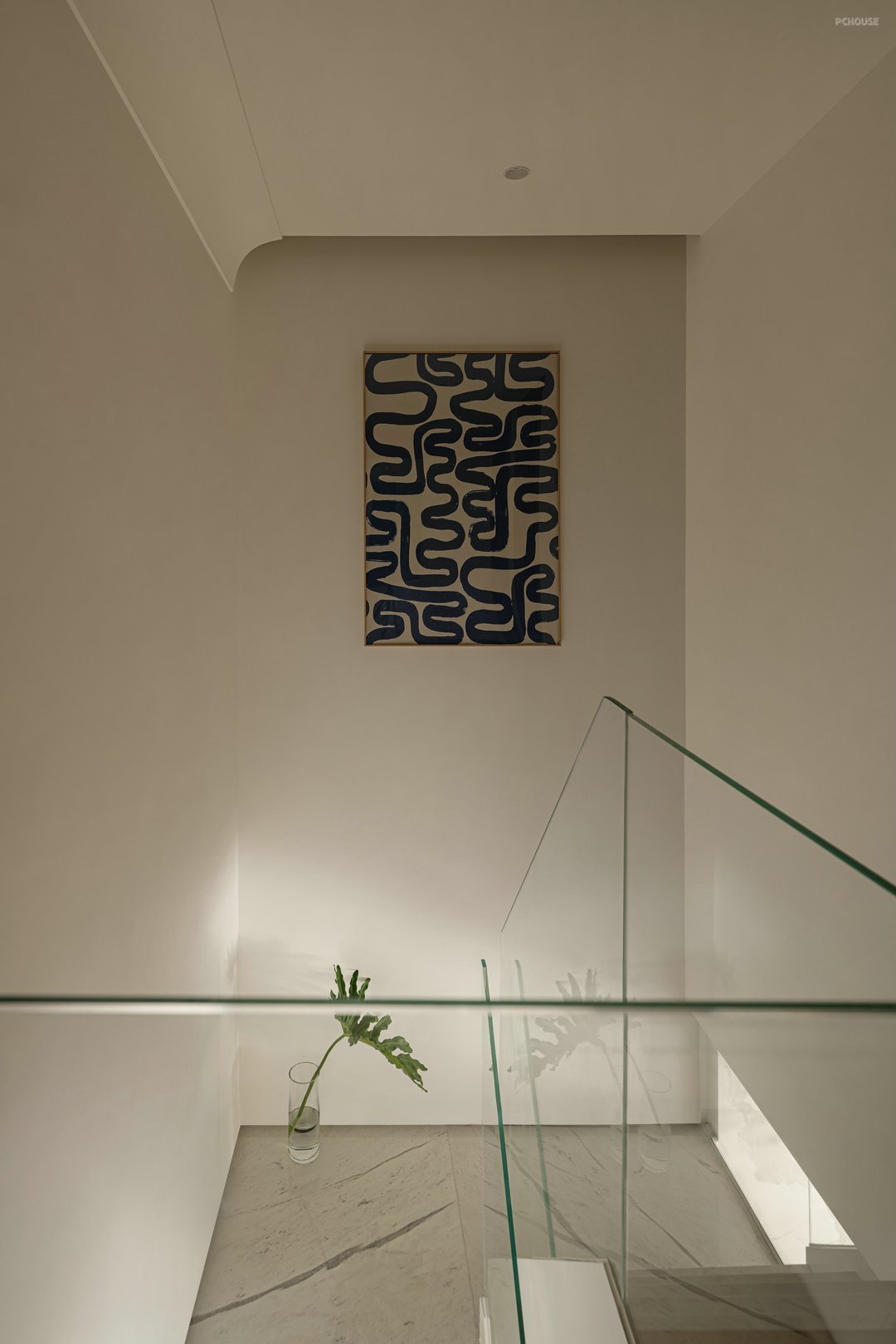
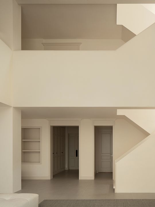
屋主要求保留建筑楼梯,原结构空间狭窄设计师采用玻璃护手延伸视觉。过道原有的梁位做了弧形修饰,结构的穿插让视觉不枯燥。
The owner requested to retain the building stairs, and the original structural space was narrow. The designer used glass handguards to extend the vision. The original beam position of the aisle has been modified in arc, and the interspersed structure makes the vision not boring.
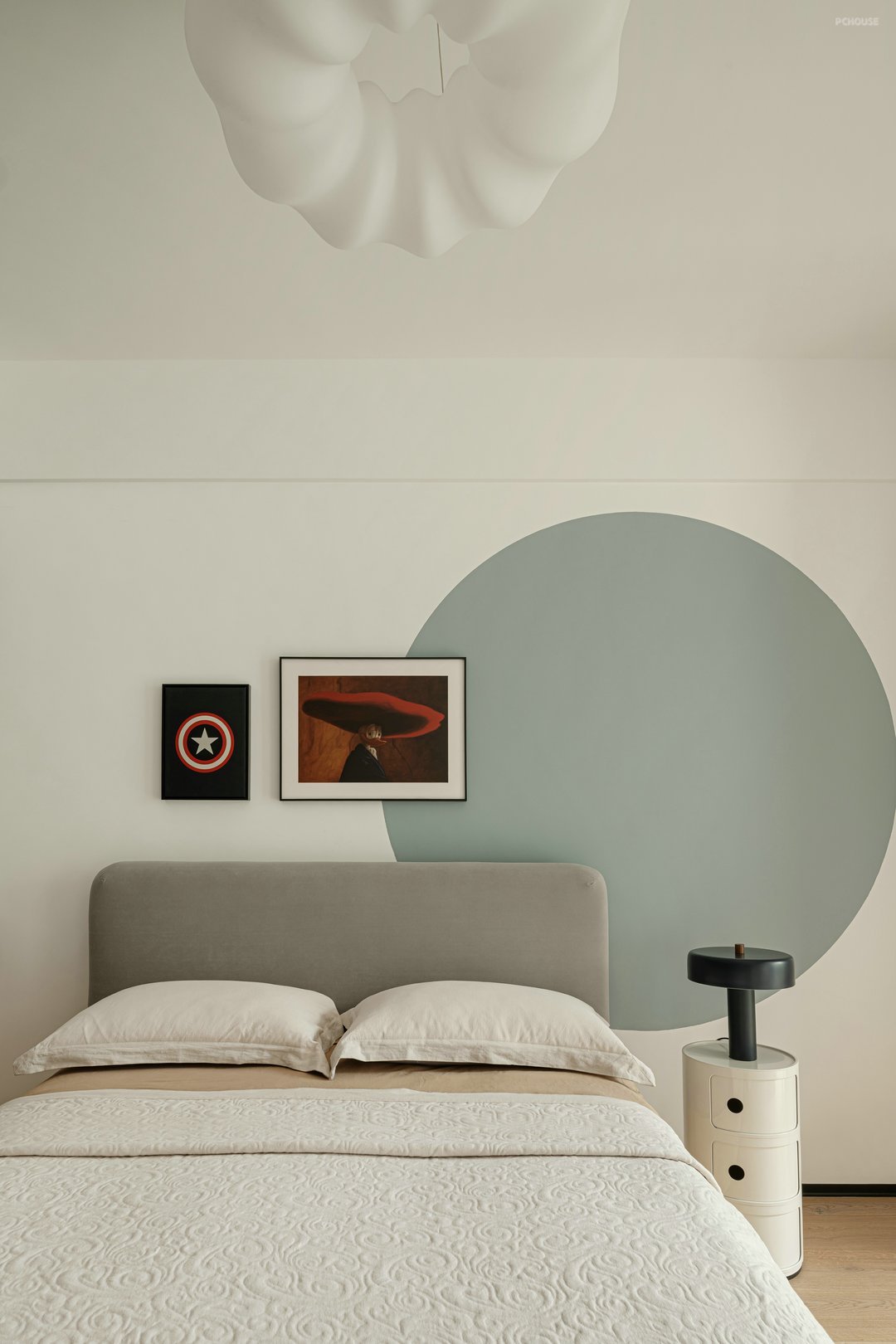
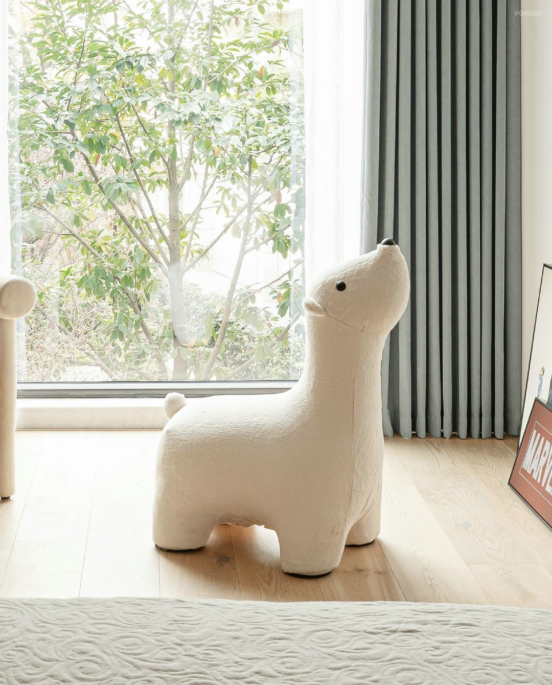
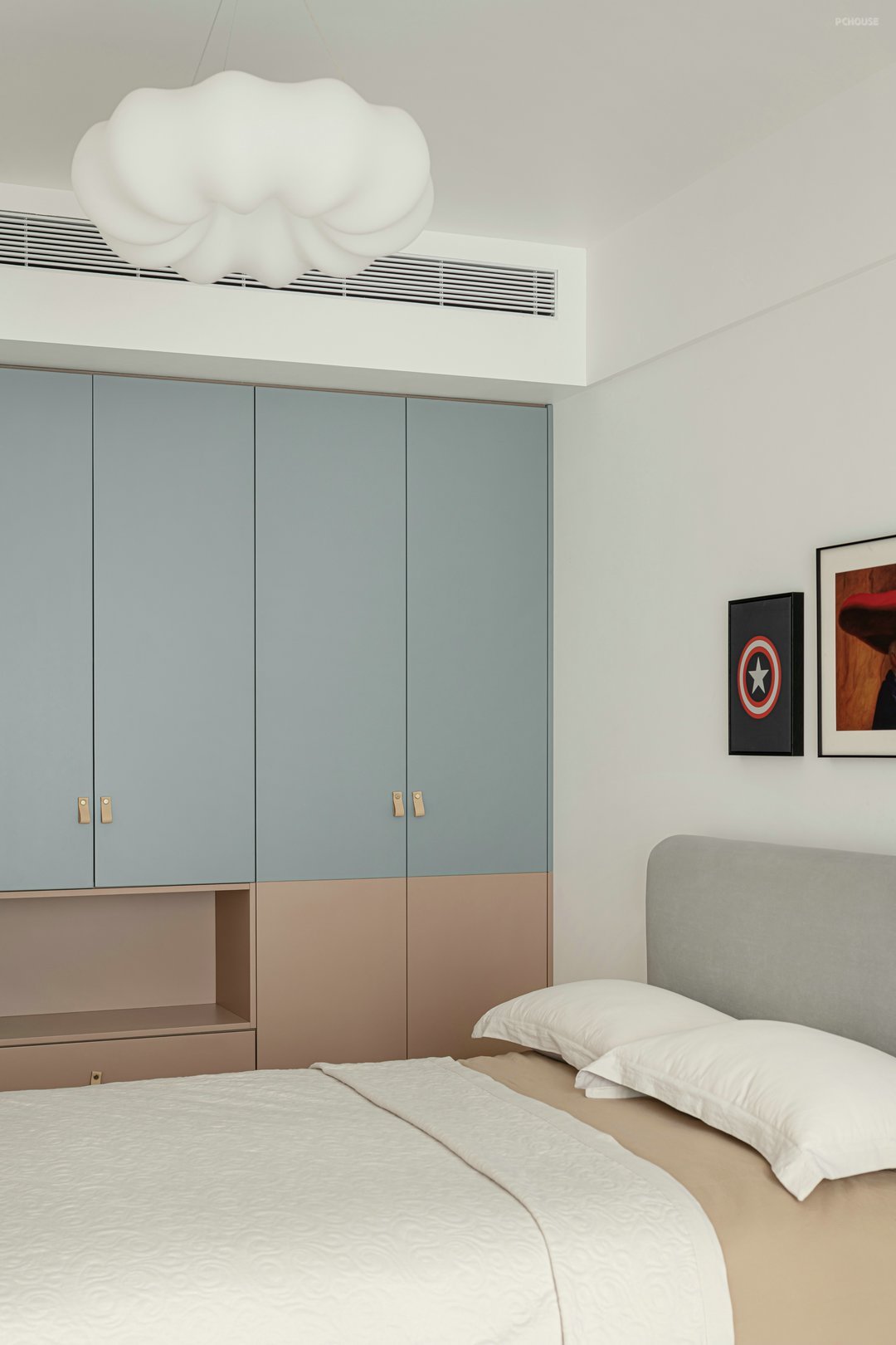
糖果色儿童房温馨、童趣。衣柜外侧留有方便小朋友独自收纳的空间。
Candy-colored children's room is warm and childish. There is a space on the outside of the wardrobe that is convenient for children to store alone.
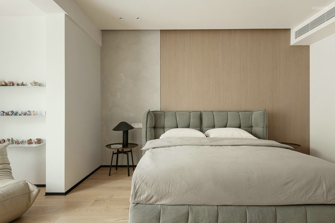
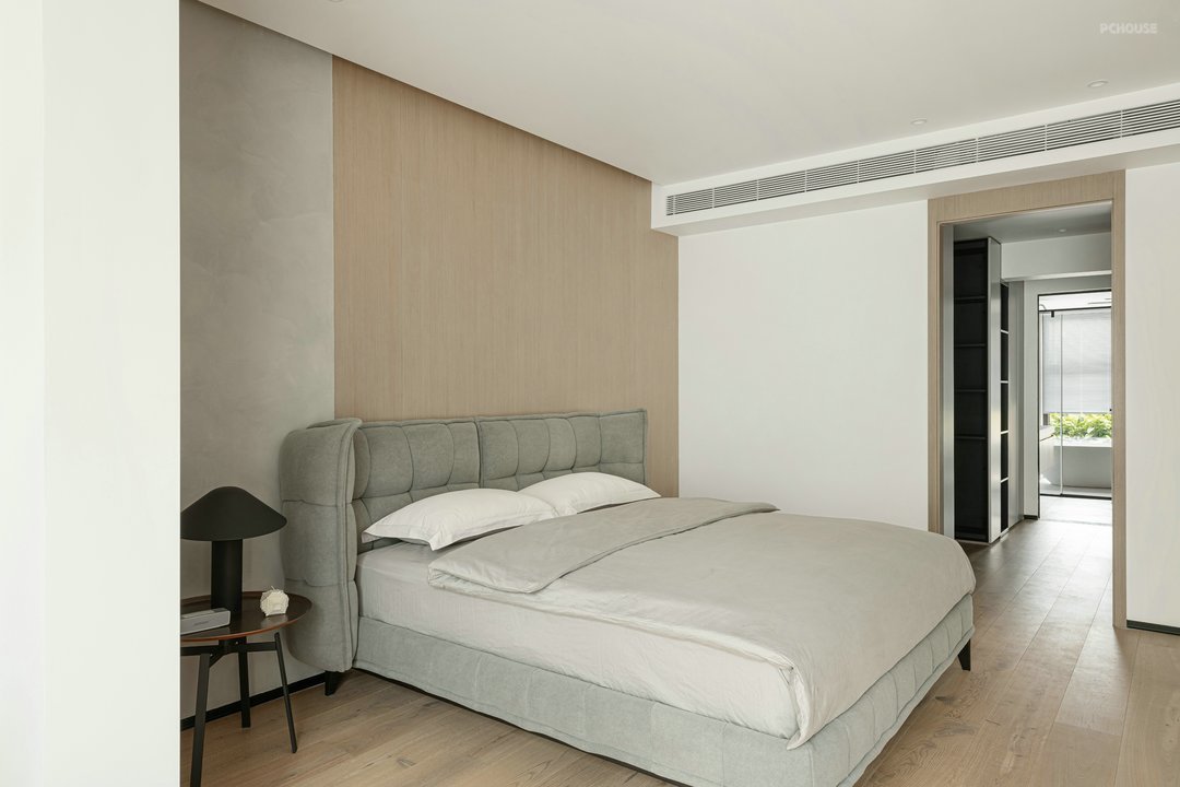
卧室是需要舒适至上的空间,我们在材质本身的质感上做了挑选,布艺靠背床、木质饰面、浅色艺术漆共同塑造了静谧、温馨之感。
The bedroom is a space that needs comfort first. We have made a selection on the texture of the material itself. The fabric backrest bed, wooden veneer, and light-colored art paint together create a sense of tranquility and warmth.
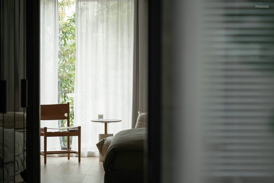
落地玻璃的阳台是卧室最佳的休憩之地。
The floor-to-ceiling glass balcony is the best place to rest in the bedroom.
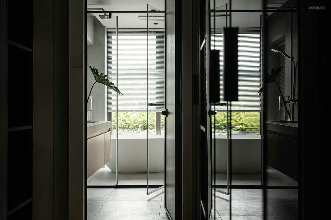
主卧空间调整布局后,增加储物功能,卧室、衣帽间、卫生间相互连通又相互独立。顶面无主灯干净利落落,背景灯带温馨,中间照明我们选择了台灯,日后可根据自己的喜好更换,新伙伴的加入会让家里有新的视觉。
After adjusting the layout of the master bedroom space, the storage function is added, and the bedroom, cloakroom and bathroom are connected and independent from each other. The top light without the main light is clean and profitable, the background light is warm, and we chose the table light for the middle lighting, which can be replaced in the future according to our own preferences. The addition of new partners will give the home a new vision.
相关案例推荐

成都集间设计
设计师相关作品

 编辑精选
编辑精选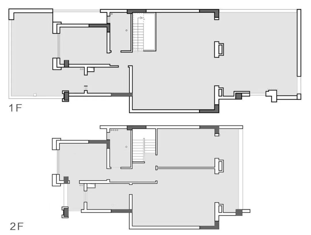














 粤公网安备 44010602000156号